Pops of Color! Decorating 101 Tips
You’ve read it here and on other design blogs. You’ve probably heard it on design shows on television and seen it in shelter magazines. ‘Pop of color’ is one of the favorite terms of the design world. A pop of color on a sofa or in a room adds interest for your eye. Like texture, color can change the look and feel of an object or room.
Many people buy the big ticket items like furniture and carpet in a neutral color. Builders use beige so much as a wall and carpet color that we now call it builder’s beige. It is fine to keep these things neutral in color, but that doesn’t mean the entire room or home must be shades of builder beige.
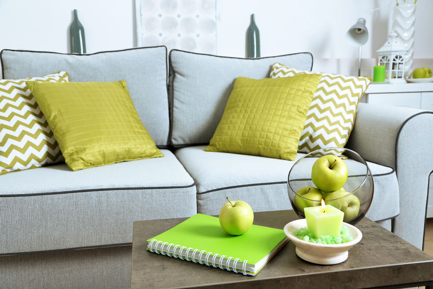
Pops of color are great in accessories if you have a neutral room. How much color and where you put it are up to you to decide. Putting color on an accent wall is a bigger statement than colorful throw pillows. A colorful area rug will make a bigger impact than a boldly colored vase or bowl on a table.
Be bold and go for combinations of colors that contrast: yellow and teal; lavender and orange; blue and rose. Adding in groups of colorful accessories will have more impact than a single object. A pop of color can mean that the same color is carried throughout the room from the rug, to the curtains, to objects on a shelf. Pops of color can bring your attention to an architectural detail or piece of furniture.
Add A Comment