online poker
May-19-2020

Pops of Color! Decorating 101 Tips

Posted by creatingyourspace under Area Rugs, Design and Decorating

You’ve read it here and on other design blogs. You’ve probably heard it on design shows on television and seen it in shelter magazines. ‘Pop of color’ is one of the favorite terms of the design world. A pop of color on a sofa or in a room adds interest for your eye. Like texture, color can change the look and feel of an object or room.

Many people buy the big ticket items like furniture and carpet in a neutral color. Builders use beige so much as a wall and carpet color that we now call it builder’s beige.  It is fine to keep these things neutral in color, but that doesn’t mean the entire room or home must be shades of builder beige.

Pops of color are great in accessories if you have a neutral room.  How much color and where you put it are up to you to decide.  Putting color on an accent wall is a bigger statement than colorful throw pillows.  A colorful area rug will make a bigger impact than a boldly colored vase or bowl on a table.

Be bold and go for combinations of colors that contrast: yellow and teal; lavender and orange; blue and rose.  Adding in groups of colorful accessories will have more impact than a single object. A pop of color can mean that the same color is carried throughout the room from the rug, to the curtains, to objects on a shelf. Pops of color can bring your attention to an architectural detail or piece of furniture.

Jan-3-2020

What to Consider When Choosing Paint

Posted by creatingyourspace under Colors, Design and Decorating, Hints and Tips

Adding color to your home’s design is remarkably impactful on the atmosphere. In fact, designers believe that the best way to completely change the environment is by painting your walls. With this in mind, you can see how important choosing the right color can be. However, there are millions of colors to choose from, and this task can feel overwhelming. When trying to select a color for your room, there are four basic rules you should keep in mind. With these in mind, your search can become a little less random and more focused on the right color choice for your home.

Color Inspiration

You will want to have general inspiration going into your project. What colors do you like? Do you have a style or design theme that you would like to mimic in your home? What colors are used as inspiration in those themes or styles? These questions can all help you dial in the choice of where to begin. Do you want a warm-toned atmosphere or a cool-toned atmosphere? Perhaps you are just looking for a neutral color tone in your room. Your color inspiration can come from many different influences. Determine what you want your home to look like before beginning your search.

Match Your Current Furniture and Belongings

If you still have no idea where to begin, use your current furniture or belongings to create a color theme. For instance, maybe you have a blue couch or beige lamp shades. Your personal belongings can be a great start at picking a color. Use these elements to help determine a theme. Even if all your furniture is a different color, the choice you choose should help harmonize your furniture.

Team Effort

If you do not live alone, you should not make this decision alone. Check with your spouse or your roommates because paint is there to last. You want to make sure everyone agrees before making the commitment of painting a room.

Test Your Paint on Your Walls

Lastly, paint can look completely different on a swatch in the store than in your own home. Most stores will have overhead fluorescent lighting. Take your paint choices home and put them on your walls. Look at them throughout the day. They may look different with the influence of natural lighting. Make sure the color you choose agrees all day with your home’s theme.

These rules can help narrow down your decision. Yet, all in all, choosing the right color comes down to you and your personal preferences. Try picking several colors or shades. Decide which one works best with what you want to accomplish in your home.

Dec-3-2019

Four Seasonal Color Palettes

Posted by creatingyourspace under Holiday

The holiday season is amongst us and full of cheer! It is always fun to decorate for the holidays and create a festive atmosphere in our homes. There are many ways to spruce up your space for the season. For example, adding a Christmas tree with a variation of lights, ornaments, and tinsel, as well as garland on the fireplace mantle, are all great ways to help make your home feel festive.

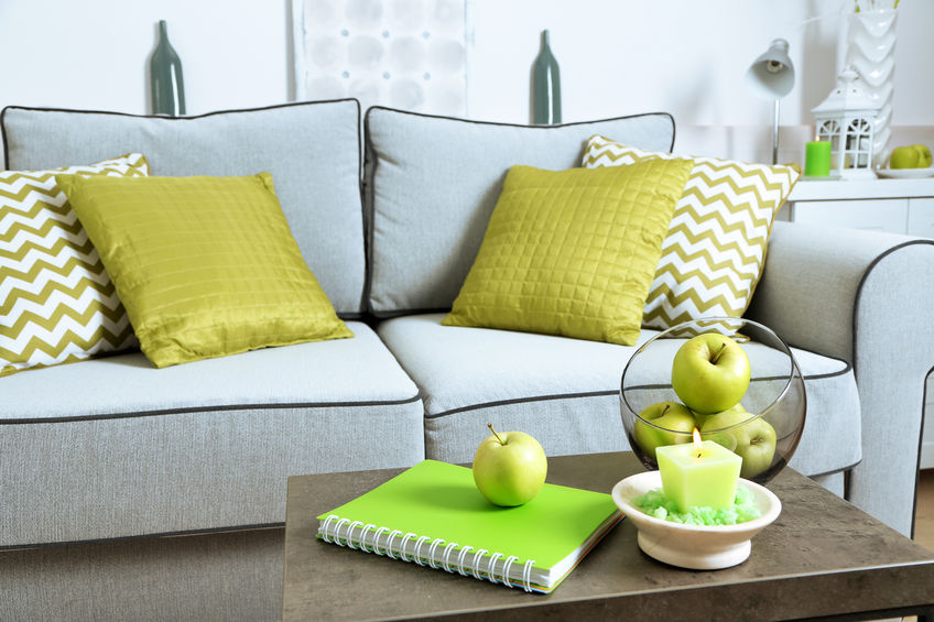
Décor can be placed throughout your whole house to help encapsulate the holiday spirit. While traditional Christmas décor can feel uniform and balanced throughout your home, you can always take your décor to the next level. For instance, if you have a neutral color palette home, Christmas décor will really pop. That being said, making your Christmas décor color palette match is essential to help the flow of the atmosphere. To help readers better understand, here are four great seasonal color palettes to consider in your home:

Red, Green, & Gold

This traditional color palette looks great in any setting since red and green are most commonly affiliated with Christmas décor. To spice it up, you can add some gold into the mix to help create a more luxurious feel. You will find that this color palette can be used in a variety of ways. For instance, a green pine tree with all red bulbs will look great with gold lights and tinsel. You can even carry this theme throughout the whole home, making green your primary color, red your secondary, and gold as your accent.

Silver, White, & Blue

Are you looking for an elegant and winter-inspired wonderland? Try using a silver, white, and blue color palette. This light and airy Christmas color palette can make your home feel elegant and beautiful. You can get a white Christmas tree and decorate it with silver and blue. Plus, this dazzling look can be added throughout the whole home. You can add white stockings and snow-inspired décor to create your winter oasis.

Warm, Earthy Tones

Are you not feeling the cold this winter? If so, make your home feel a little bit warmer with this rustic Christmas palette. You can add earthy, warm tones throughout your space while still being festive. The forest green from a real pine tree and garland in your home can be a great start. You can add pine cones and some candles to take a warmer approach on decorating your home.

Eclectic Style

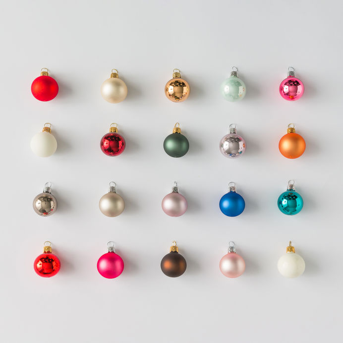
Since Christmas is fun, you can be as creative as you desire! Perhaps you are into all the colors this season has to offer. From the diverse wrapping papers to rainbow-colored lights on the tree, this eclectic styling can be a fun way to decorate as well.

Let your holiday décor feel more uniform by adding a color theme to your space. What colors do you use during the holiday season? Have you tried any of these color themes? Let us know below in the comment section.

Jun-13-2019

Transform Your Living Room with Bold Colored Sofa

Posted by creatingyourspace under Design and Decorating

When it comes to interior design, most people fear using bold colors. If you are not afraid of using color or are interested in dabbling with hues in your living space, you might want to consider investing in a bold colored sofa. In fact, a vibrant hued sofa can liven up your living room and completely transform a space. Introducing color through furniture is a great place to start. Here are four sofa colors you might want to try:

Blue

Are you slowly developing a tolerance for color? If so, consider infusing the space with a deep, luxurious blue-hued sofa. Blue is a color that most people can easily tolerate since it is calming and still considered traditional. In addition, a blue colored sofa can complement a range of decor styles and designing a living room around such a piece is not a challenge.

From light baby blue to deep navy, there are many different types of blues you can select for your sofa color. If you want to make a significant impact, you should opt for a vibrant, blue color. Depending on the shade, you can pair it with neutral elements and natural materials.

Green

Green is another calming color that looks great in any living room style. Since green is often associated with nature, it is bound to make you feel relaxed and at ease. When searching for the perfect green couch, consider investing in an emerald-hued sofa. Emerald is a rich color that gives off luxe vibes. A green sofa works well in a contemporary or traditional style room. Also, emerald works well with other colors such as pink, yellow, and blue.

Yellow

Yellow has come a long way in the design world. It is no longer associated with a dated style. Just think, a vibrant yellow sofa can inject so much life and energy into a space. From mustard, buttercup to sunshine yellow, there are a variety of shades you can choose from in the yellow family. Yellow is a sleek and clean color that pairs beautifully with neutrals and other vibrant hues.

Purple

Purple may be the last color you would think to use in your living space, but a purple sofa could be just the thing that your living room is missing. Purple is often associated with elegance and makes for the perfect piece if you desire to inject richness and character into your living room. For a royal touch, be sure to try out a purple sofa.

Which sofa color sparks the most interest in you? We would love to hear your thoughts below in the comment section!

Tags: , ,
Mar-28-2011

Bright Colors and Light Wood

Posted by creatingyourspace under Design and Decorating, Hardwood / Laminate

If you love this color, there’s good news for you this year. Pantone, the company that provides color palettes to manufacturers, graphic artists and designers has selected a pinkish red, called Honeysuckle, as its color of the year for 2011.

When Pantone highlights a color like this one, you will soon see it in a variety of consumer products. From fashion to furniture, designers and manufacturers focus on color trends and recommendations.

If you want to bring this color or any other light bright tones into your home, you can’t do better than a light wood floor such as this one as the foundation. You can see from the photo that light pinks and blues work beautifully with this floor.

This particular floor is a maple hardwood, but bamboo would also complement the colors. If you want your color options to change with the trends, the seasons or your own mood, this floor is a good start. Add in furniture with washable white slipcovers and other neutral shades, and then use pillows, throws, area rugs and accessories to focus your color choices. By changing out a handful of easily-replaced elements, you can create an entirely new feel for any space in your home. This is a perfect option if you love color but don’t want to settle for just one combination.

Light wood floors are a perfect choice for the changing needs and desires of children. Beautiful in a nursery, this wood floor grows as the child does, allowing for dramatic variations in color and style over time. Even a dramatic adolescent choice of black for the walls would be softened to some extent with the light floor.

If you’re looking for flexibility and durability, consider the advantages of a light wood, bamboo or laminate. It will provide the range you need to make décor changes over time.

Mar-21-2011

Trending Now: Porcelain Tile

Posted by creatingyourspace under Tile

Porcelain tile is the hard working chameleon of the tile world. Known for its durability, porcelain tile is denser than ceramic tile, making it more resistant to stains, chipping and temperature changes. It is a great choice for flooring throughout the house and is a popular choice for kitchens and baths.   Porcelain tiles come in an almost infinite number of sizes, surface textures, and colors.

Size

Porcelain tiles range from 1in. x 1in. to 20in. x 20in. squares, the classic 2 x 3in subway tile to uniquely shaped modern tiles.  When considering what size tile to select, think about how the tile will function in the space. Do you want a strong pattern? Choose smaller tiles. Do you want a more uniformed look? Select larger tiles so there will be fewer grout lines.  You may want to do a mix of sizes, large squares with smaller accent tiles to give more interest to your floor or backsplash.

Texture

Porcelain tile is available in everything from high gloss to matte faux-travertine textures.  Rough textures faux-stone porcelain tiles are a great option for a shower or bathroom floor. Porcelain tiles are a popular option for a kitchen floor because of their durability and easy maintenance.

Color

Like ceramic tile, porcelain tile comes in a rainbow of hues.  Solids, speckled, and stone patterned tiles mean that you will easily find a porcelain tile to match your home’s style and décor. Many of today’s porcelain tiles are almost indistinguishable from stone.  You can find choices from travertine to marble to linen in a variety of colors.

Feb-26-2011

Medieval Style

Posted by creatingyourspace under Design and Decorating

This room, although clearly constructed of today’s materials, strongly echoes days of yore when a person’s home was his castle – literally.

Would you like to insert a medieval flavor to your décor? Take a few tips from this room to get started. Only a few of these touches will take your space back more than a few centuries.

To begin with, the slate floor helps to create the character of a castle while avoiding the problems associated with the reed floors popular at the time. Slate’s rich variety of color and texture adds a crafted mood to the floor that suits the Gothic mood of this room.

The window, doorway and fireplace surround echo a gothic mood with the classic arch shape. Although it is rarely seen, several window companies offer windows with this Gothic arch, and a number of companies offer window coverings that will work for this shape. The style certainly maintains the feel of another time.

Stone carvings and tapestries suit the space and keep to the medieval framework. Choosing tapestry throws to cover the upholstery and adding candles and greenery also complement the look. The balcony almost begs to see Shakespeare’s youngest heroine waiting for her Romeo.

While you may not want a room as strongly set in time as this one is, there are inviting elements for anyone who wants to echo another age while creating a unique space to suit their own tastes.

Feb-2-2011

Choosing Vinyl Works

Posted by creatingyourspace under Vinyl

Question: I’m thinking of having a vinyl floor installed in our kitchen because I like the way it feels underfoot, but my husband doesn’t think it will work with our high-end cabinets and granite countertops. Is he right?

Answer: You may want to take your husband on a visit to our showroom to see the truly beautiful choices you have in vinyl today. New designs really stand up to more expensive flooring options. This kitchen shows one vinyl choice that closely resembles porcelain tile. The upscale design easily works with this kitchen.

Vinyl floors are also gentler on the feet in a room that involves a lot of standing if you like to cook. Vinyl, laminate and wood floors are considered “soft” flooring as opposed to tile and stone’s hard surfaces.

Vinyl is also an easy clean floor. Just a damp mop or cloth keeps it looking its best. This particular pattern and color combination will keep the every little spot from showing dramatically, keeping the room looking nice even after a major cooking extravaganza.

The other major advantage to vinyl is cost. With its reasonable cost per square foot compared to tile or stone, you can select a higher-end vinyl flooring while still staying in your budget.

As you make choices for your home, be sure to pay attention to your personal preferences. This is not a model home; it’s the place you will be living in, probably for years. When you combine your design goals with the functionality you really want, then you will have a home that is both livable and beautiful.