Interior Summer Renovation Projects to Transform Your Home
Summer is an ideal time to embark on interior renovation projects. With longer daylight hours and a more relaxed atmosphere, it’s the perfect season to update and refresh your home’s interior. Whether you’re looking to enhance your living space’s functionality, modernize your decor, or simply make your home more comfortable, there are numerous summer renovation projects to consider. Here are some exciting ideas to inspire your interior summer renovations.
1. Revamp Your Living Room
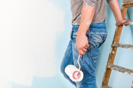
Fresh Coat of Paint
One of the simplest yet most effective ways to transform your living room is by giving it a fresh coat of paint. If you love the feeling of summer in your home year round, choose light, airy colors to brighten the space and make it feel more open. Summer hues like soft blues, greens, or warm neutrals can bring a refreshing change to your living room.
Update Furniture
Consider updating your furniture to give your living room a new look. Invest in a new sofa, add a stylish coffee table, or incorporate comfortable chairs. Opt for furniture pieces that are both functional and aesthetically pleasing, enhancing the room’s overall appeal.
Add New Lighting
Lighting can dramatically change the ambiance of a room. Replace outdated fixtures with modern, energy-efficient options. Consider adding floor lamps, table lamps, or even installing dimmer switches to control the mood of the room. Natural light is also a great asset, so make sure your windows are clean and unobstructed.
2. Modernize Your Kitchen
Cabinet Update
If your kitchen cabinets are looking tired, consider replacing them. Cabinetry is a very important decision in the building or remodeling process. If you haven’t shopped for cabinets lately it can be very overwhelming with all of the design and finish options available since you typically don’t plan to replace your cabinets! We have taken the guesswork out of giving you the basics you need to know before shopping. Cabinets are so important because they keep you organized and they are a major design element in a room. With today’s technology, there are endless finish options and organizational options giving you the opportunity to get a product that fits your style and personality exactly- budget permitting, of course.
Upgrade Appliances
Summer is a great time to upgrade your kitchen appliances. Energy-efficient appliances not only look sleek and modern but can also help reduce your energy bills. Stainless steel appliances are a popular choice for a contemporary look.
Install a New Backsplash
A new backsplash can add a pop of color and texture to your kitchen. Choose tiles or stone that match your kitchen’s decor and are easy to clean. A stylish backsplash can become a focal point and enhance the overall aesthetic of your kitchen. Browse our tile catalog for inspiration.
3. Refresh Your Bathroom
Replace Fixtures
Upgrading your bathroom fixtures can have a big impact. Consider replacing old faucets, showerheads, and towel bars with modern, water-efficient options. This not only improves the look of your bathroom but also enhances its functionality.
New Flooring
If your bathroom floor is outdated or showing signs of wear, summer is a great time to replace it. Choose durable, water-resistant materials like tile, stone or luxury vinyl. These options are available in various styles and can transform the look of your bathroom. Get started by checking out our flooring products on our website.
Add Storage Solutions
Clutter can make even the nicest bathroom feel cramped. Add storage solutions like shelves, cabinets, or vanity upgrades to keep everything organized. Stylish storage options can also serve as decor elements, enhancing the overall look of the room.
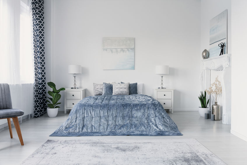
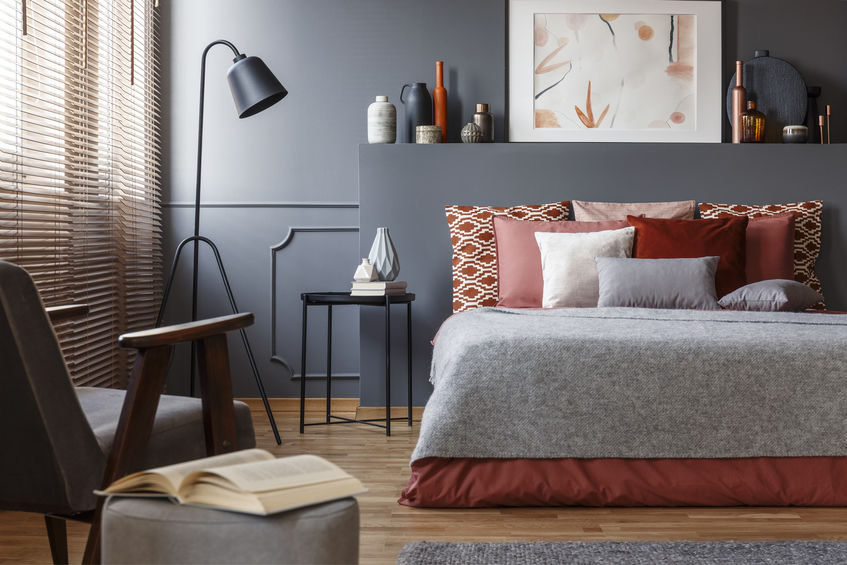
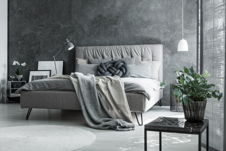
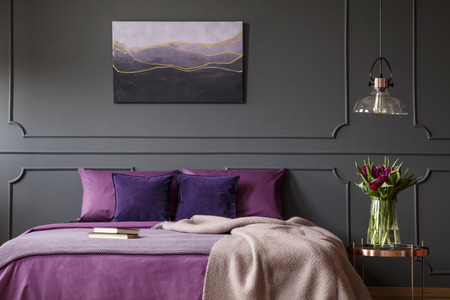
4. Transform Your Bedroom
Update Bedding and Curtains
Refreshing your bedding and curtains can instantly transform your bedroom. Choose light, breathable fabrics for summer and opt for colors and patterns that bring a sense of calm and relaxation. New curtains can also help control the amount of natural light entering the room.
Create a Feature Wall
A feature wall can add a focal point to your bedroom. Use wallpaper, paint, or even wood paneling to create a unique and stylish accent wall. This simple change can make a big impact on the overall design of the room.
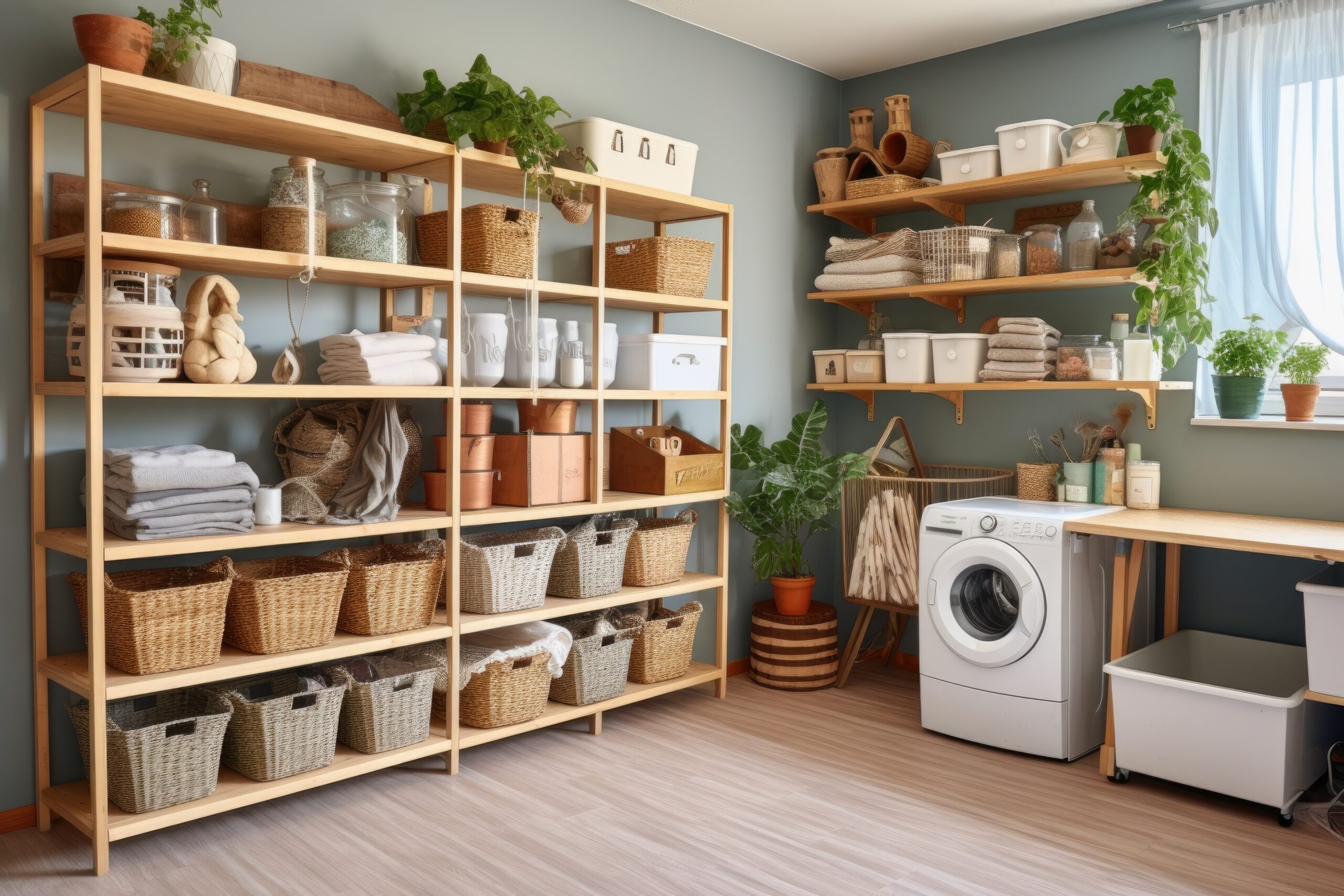
Improve Closet Organization
A well-organized closet can make your bedroom feel more spacious and functional. Invest in closet organizers, shelves, and storage bins to keep everything in its place. A tidy closet can also make your daily routine more efficient. Your laundry room is another great place to organize as well.
5. Upgrade Your Home Office
Ergonomic Furniture
If you work from home, upgrading your office with ergonomic furniture is essential. Invest in a comfortable chair, a spacious desk, and accessories like a monitor stand or keyboard tray. Ergonomic furniture can improve your productivity and overall well-being.
Decorate with Plants
Adding plants to your home office can create a more pleasant and productive environment. Plants improve air quality and add a touch of nature to your workspace. Choose low-maintenance plants like succulents or spider plants for easy care.
Enhance Lighting
Proper lighting is crucial for a home office. Ensure you have a good mix of natural and artificial light. Task lighting, like a desk lamp, can help reduce eye strain and improve focus. Position your desk near a window to take advantage of natural light during the day.
Summer is the perfect time to focus on interior renovation projects that can transform your home. Whether you’re updating your living room, modernizing your kitchen, refreshing your bathroom, transforming your bedroom, or upgrading your home office, these projects can enhance the beauty, functionality, and comfort of your living space. By taking advantage of the longer days and warmer weather, you can make significant improvements that you’ll enjoy for years to come. Happy renovating!