online poker

Apr-10-2020

Memphis Interior Design Style

Posted by Carpets N More under Design and Decorating

Interior design is a coordinate plan with clear guidelines in place to help enhance a home’s aesthetics and functionality. Plus, there are hundreds of styles that we can use to help create our space. Many interior design styles have come and went while we see interior design evolve over time, just like fashion and beauty. Some styles have indeed survived the test of time where others come and go. Many bold and contemporary designs seem to be much shorter-lived than safe and neutral designs. Typically, this is because neutrals do not make such bold statements where other colors can be very influential. Yet, when new bold design themes do come about, they usually change the perspective entirely and can revamp the next generation of design.

During the 1980s, Italian designer Ettore Sottsass and his design team created a daring and novel design theme that would break all the rules of the current design times. This design was referred to as Memphis design, which was named due to the famous Bob Dylan song “Stuck in Memphis.”

What Is Memphis Design?

Memphis design is nothing short of abstract. It is probably the easiest design to recognize because of how whimsical and unique it is. During the 1940s, Mid-Century Modern took the forefront of many designs. It revolutionized architecture and home designs throughout the United States. However, having too much of a good thing can soon make it overused. Since Mid-Century Modern was a very minimalistic and neutral color palette, it had constructed rules which help create and make the atmosphere. During the 1980s, Sottsass and his team decided to make something untraditional or “radical, funny, and outrageous” as they put it. They created the rule-breaking, whimsical, pop art, and colorful Memphis design.

The Return of Memphis Design

Likewise, we have seen neutral color themes for the last several years. For instance, many rooms have been painted gray, beige, and white, and as children grew up with this color palette, they began to want more color. However, those children are adults and homeowners today, and we notice that generation X loves their colors. They are adding colors more than ever into their homes and apartments. So, we slowly see the return of rule-breaking colors and patterns to create an artsier and maximalism-styled home.

How to Master This Whimsical Style

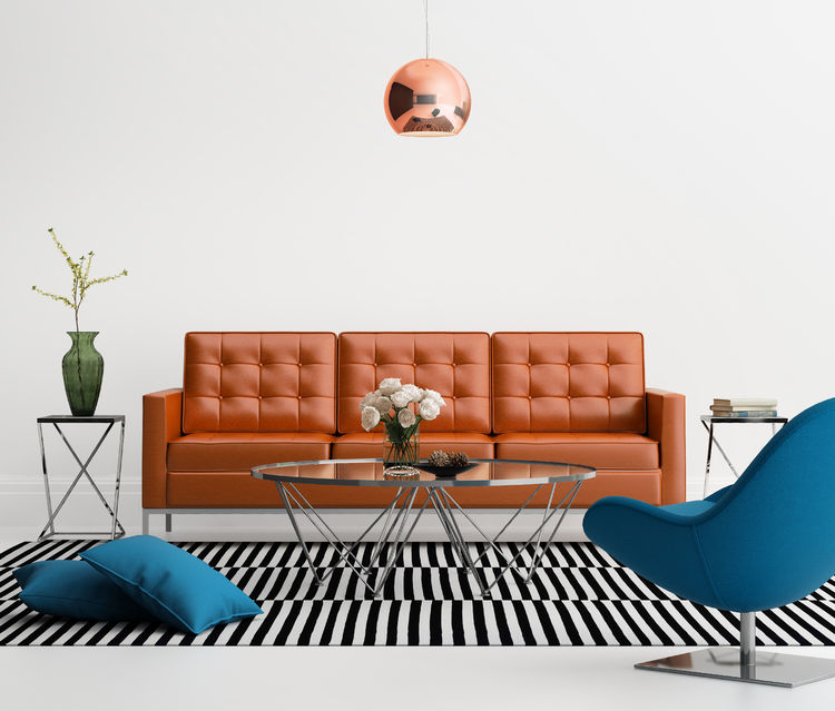
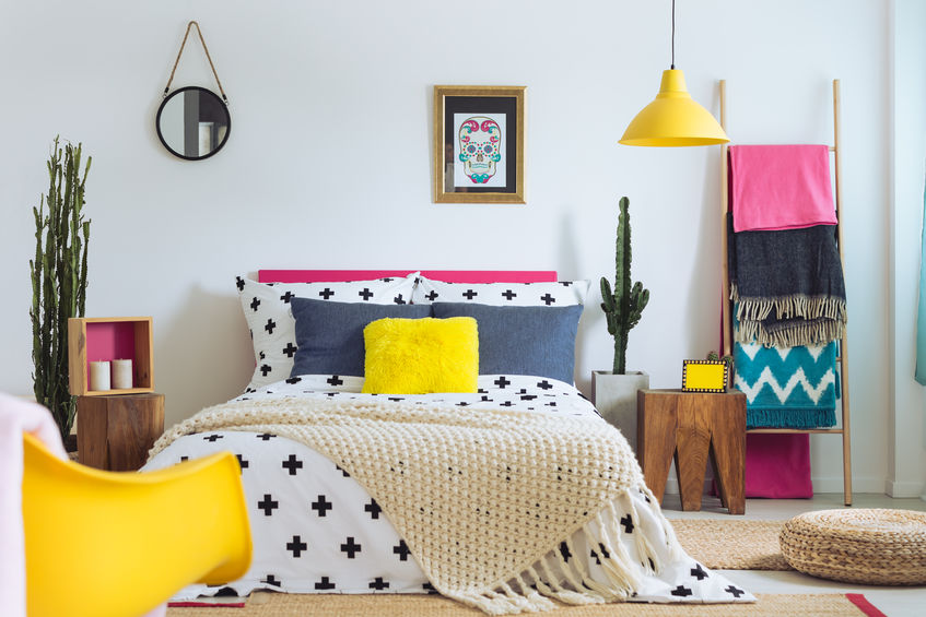
The color palette is completely open but thrives off bold, neon, and pastel colors and a lot of them! Many rooms will have more than a dozen bold colors incorporated in their design. Plus, this style has unique and contemporary geometrical shapes to construct furniture and patterns. It also uses a ton of patterns where most designs stick to one or two.

What do you think of this crazy design? Is it refreshing to see colors back into homes, or is this design too much? We would love to get your opinion below in the comment section.
Apr-2-2020

What Is Scandinavian Design?

Posted by Carpets N More under Design and Decorating

When designing your space, you have the freedom to add whatever décor, paint colors, furniture, and style you want. Without guidance, the overall look can become a chaotic mess; therefore, it is important to have a structure to your design. You want your home to flow and your design theme to agree with itself. Fortunately, there are several interior design themes homeowners and businesses return to for there general concepts and styling, which look great when replicated. One of these design themes is Scandinavian. You may know this styling more as the “Ikea” design styling. Scandinavian design is an excellent design with sleek lines, a clean atmosphere, and a minimalistic approach. So if you are looking to master this style in your own home, here are several key factors that contribute to this styling:

Color Palette

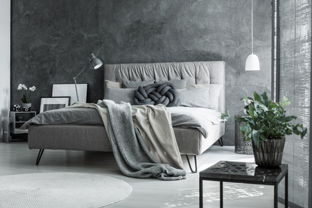
As soon as you see a Scandinavian design, you will quickly notice the very muted and neutral color palette. Typically, the designs are made from whites, greys, blacks, and beiges, yet some very pastel colors can trickle into the design as well. These muted colors allow light to travel more freely in the space and open up the atmosphere.

Woods

With the neutral color palette, many light-colored kinds of wood are included in the designs. From hardwood flooring to furniture designs, wood is essential to completing this styling. Look for light woods like beech, pine, and ash. You will also notice that authentic Scandinavian design never uses wall-to-wall carpet. Instead, consider adding a comfortable rug to the room for added comfort.

Greenery and Natural Lighting

A dull color palette would feel dead without the proper accommodation of greenery and natural lighting. To master Scandinavian design, make sure you allow natural lighting to flow into your space as much as possible. You can also flourish your room with plant life to help spruce up and revitalize the area.

Minimalism

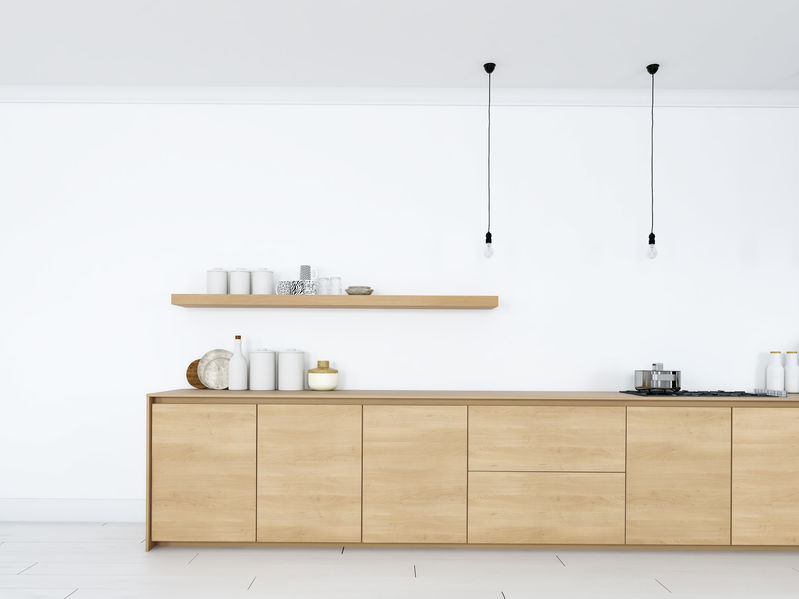
This design style features sleek lines and a very minimalistic approach. The light color palette and natural elements help open up the environment. Even art work is considered to be very minimalistic in these design themes. Remember, less can be more in many design situations. Do not over-clutter your space.

Cozy Textiles

The last thing that brings this design full-circle is the attention to cozy textiles. The sleek lines, hard cut furniture, wood, and grey atmosphere can quickly drain its comfort. However, Scandinavian design has a solution for this. This design commonly indulges in cozy textiles, warm throw blankets, fun pillows, and great rugs. Do not forget to add your space of comfort to these areas to help complete your design.

All in all, Scandinavian design is highly praised for its simplicity and attention to detail. What do you think of this design style? Would you use it in your own home? Let us know your thoughts below in the comment section, and for more insight on designs, make sure to subscribe!

Mar-26-2020

Popular Bathroom Remodeling Trends

Posted by Carpets N More under Bathroom Blogfest, Remodeling 101

We are already a few months into 2020, but interior design trends are still filtering through as we welcome the new in exchange for the old. As one of the more popular rooms to renovate, bathroom trends tend to see even more rapid changes in the design industry. To inspire your next bathroom remodeling project, we have compiled several of the top trends that will have all of your houseguests talking. Let’s take a look!

Turn up the Saturation

While neutral wall colors had their moment, bold colors are making a big comeback. In fact, homeowners love the instant “wow factor” that bold colors can add to a bathroom. From evergreen walls to navy blue tile floors, you can take an otherwise lifeless bathroom interior and completely transform it. Plus, you can even play with your paint by filling all the walls with color, stenciling patterns onto the paint, or even bringing emphasis to one side of the room with an accent wall.

Not the Average Subway Tile

Rough textures with intricate patterns are popping up on bathroom tiles everywhere. These designs add dimension to your bathroom walls that smooth tile just cannot. You can either continue with the bold color trend mentioned above, or you can have the textured design speak for itself with neutral tile. Either way, the unique patterns will be sure to turn heads.

Make Room for Storage

Minimalist storage was favored for a good while, but we are back to functional styles that allow homeowners to store their bathroom necessities without sacrificing aesthetics. For instance, you can install subtle cabinets that spin out from unused corners or drawer spaces or take advantage of all of your unused wall space. The point here is to make space where there seemingly is none.

Stone Vessel Sinks

Stone materials automatically add a layer of sophistication that regular ceramic or porcelain can never. In fact, many designers opt for unique, hand-carved vessels. They make it appear as if the vessels were naturally growing out of their walls or from their counters. The look is very unique and timeless.

Metal Frame Showers

If you want to add a bit of rustic charm to your bathroom, this upgrade is for you. Metal frame doors have been slowly inching their way in over the last few years, but 2020 is expected to see a sharp increase in this particular design choice. It is becoming especially popular in trendy homes with smaller bathrooms since the window-like appearance gives an illusion of openness.

Built-In Media

Singing in the shower is about to get a whole lot easier with built-in Bluetooth speakers. Media devices usually come separately, but now showerheads are coming equipped with multimedia play, and some people are even installing HD televisions into their walls so they can watch their favorite shows while they soak.

Which of these bathroom trends was your favorite? Let us know below in the comment section!

Jan-15-2020

Achievable Design

Posted by Carpets N More under Videos
Dec-16-2019

What Is Art Deco?

Posted by Carpets N More under Design and Decorating

Interior design has many great styles to choose from when designing your home. From Rustic to Modern and everything in between, there is a style for everyone. Another great style option is Art Deco. This style first came to fruition during the roaring 1920s and was used in many attributes of design, including fashion and marketing. Art Deco merges geometrical patterns, metallic finishes, and bold colors to make something truly glamorous. If you love Art Deco and want to master it in your own home, here are some great tips and tricks:

Geometrical Patterns

A key factor in any great Art Deco design is geometrical patterns. Art Deco will incorporate repetitive patterns in many places. Consider some geometrical-patterned art for your walls or a patterned rug to spruce up the ground. Incorporating geometrical patterns is a must for your Art Deco design.

Adventurous

Be bold and adventurous when designing with Art Deco. While black and white are used a lot in Art Deco, this is used to create contrast. Art Deco does not neglect the power of colors. Art Deco uses bold colors and unique furniture to make a statement. Feel free to be adventurous and daring when designing your home.

Metallic Finishes

This Hollywood design is known for its glamorous, sheen look. To help obtain this look, make sure to include a lot of metallic finishes. Golds, silvers, even reflective chromes are all powerful elements in this retro-looking design theme. Make sure to add these fun, metallic finishes throughout your design.

Art Deco was a futuristic look of the past. It is flexible, allowing many colors and textures to be added to it. If you love this Retro look, make sure to use some of these key elements to help design your space. Art Deco is still used in many works of art and marketing today. Its unique and powerful style can quickly demand attention.

What do you think of Art Deco? Is this design still worthy of being in homes today, or does it belong in the past?

Nov-26-2019

Green Centerpieces

Posted by Carpets N More under Videos
Nov-18-2019

Decorating and Designing with the Color Grey

Posted by Carpets N More under Colors, Design and Decorating

Over the years, we have seen more and more shades of grey come into the marketplace. It has been a staple in home design and fashion for several years as a great neutral option while also feeling very sophisticated. Since some homeowners are hesitant that grey may be too dark, the design industry provides a broad spectrum of shades. With a spectrum ranging from black and white (literally), grey is an extremely versatile option to use in your own design. It will not clash with other colors but can feel elegant and timeless. Here are some great ideas to consider when decorating and designing your space with the color grey:

Grey Works Well with Cool Tones

Grey works great with complementing the cool tones throughout your home. It feels very grounded in nature and can help bring out the balance in rooms using cool tones. Use softer cool tones and the color grey to neutralize the space. You can even use black and white to accessorize your space without crossing out of your grey color palette.

Grey Works Well with Warm Tones

Grey can also work very well with warm tones. It can emphasize and balance your warm reds, oranges, and yellows while adding a darker neutral tone to the room. Where beige and tan can sometimes reflect too much into red tones and overwhelm the space, grey can help make the area grounded. It works great at complement to warm wood tones and other wood elements as well. When adding grey in spaces with warm tones, you will not get a dreary environment but a very well-grounded and established design.

Grey Is Sophisticated

Colors can influence moods. Grey is known to be a cool, neutral color that can create balance. It has a broad spectrum of moods, from dull and dingy to formal and sophisticated. It is incredibly diverse and can be used in any room. This is a quiet and reserved color, yet it can also be very influential. It is not very common to get a pure grey from just black and white mixed together. Most greys will have subtle hues of blues, greens, or yellows in them to help spruce up the space.

Empower your living space by incorporating grey. Using it throughout your design is never a bad decision. It works in almost all atmosphere and can be a great addition through flooring, cabinets, wall paint, décor, and more. Knowing when and where to use grey is vital.

What do you think of the grey color craze lately? Is it just a fad, or is grey really the perfect color for design? Let us know your thoughts below in the comment section!

With the seasons changing, your home may become a little more cold than usual. Or perhaps, your home has always been on the cold side. No matter what your circumstance may be, you are cold and do not like it. To help you fight back against the chill, we have created five genius ways to use decor to add warmth to your home. Let’s take a look! 

Décor Ideas for a Cold Home:

1.  Work with Warm Tones.

The colors used within your space can actually make the room feel colder. Be sure to use a warm tone color palette within your space to help create a more comforting and cozy environment. Warm tones consist of colors like tans, browns, beiges, reds, burgundies, oranges, rusts, yellows, and olive-greens. Their warm nature will help add comfort and coziness to a chilly space.

2.   Add Comfort.

If your floors are cold to the touch, it can be imperative to begin the warming process with proper textiles and insulation. Layers can create the perfect “warming” effect that you desire. Plus, they help to add a stylish touch to the space. Be sure to add plush pillows, soft blankets, and cozy rugs for add softness and warmth.

3.  Genius Hacks.

If you know that insulation is specifically a problem in your home, you may find it helpful to hang wall tapestries. While being extremely stylish additions, they can help warm up your space and add a layer of heat. Plus, they are easy to remove which makes switching up your décor easy than ever.

4.  Focus on Windows.

Windows can, in fact, be a significant source of cold drafts. If you are looking for a stylish way to warm up your windows, you can purchase heavy curtains for your windows. The heavy curtains will help to reduce the chill caused by drafts and keep your room feeling warm and toasty.

5.  Your Getaway.

Our last and final tip for cold homes is to create a cozy, comfortable bed. With a bed that oozes warmth, you will be excited to jump into it after a long day. To help add warmth, we recommend adding extra blankets, pillows, and sheets. Plus, you can even add a heated blanket for chilly nights. Just be sure to shut it off when you are not with it.

We hope you enjoyed these tips and tricks! Let us know how you stay warm in the comment section

Aug-20-2015

20 Design Hacks For Your Vintage Bathroom

Posted by Carpets N More under Interior Finishes

If you’re in the midst of designing a vintage inspired bathroom you might have recently found yourself short on creative ideas. Typically the easy part of the project is the larger design elements. Fixtures can be figured out by way of the Internet.  Flooring can be designed by visiting one of our locations and talking with our consultants.

But when you get to down to the details it’s sometimes tough to reimagine ways to use things that will look good in bathroom inspired by design from a century ago. Fret not! Here are 20 snazzy ideas for ways to decorate and store common bathroom items!

  1. Old, wooden step stool with 2-3 steps used as a towel rack.
  2. Old, wooden crates to hold magazines.
  3. Vintage wall mirrors hung over the sink.
  4. Small drawers removed from an old wooden desk to store toiletries.
  5. Old-school hard sided suitcase for extra toilet paper and bathroom sundries.
  6. Crystal knobs mounted on the wall to hang towels and clothes.
  7. Chalkboard.
  8. Baskets hung on the wall facing outward, like shelves.
  9. Glass jars with tin lids for Q-tips, cotton balls, etc.
  10. Tin pail to hold a plant or flower arrangement.
  11. Antique laundry washboard hung on the wall as décor.
  12. Bath products with vintage, apothecary style labeling.
  13. Apothecary cabinet for storing and neatly organizing toiletries.
  14. Antique hand held mirror(s) lying on a surface or hung on the wall as décor.
  15. Vintage lace curtains.
  16. Soaking tub rack that fits across your claw foot tub and holds soap, a candle, reading materials.
  17. Antique chandelier.
  18. Old, tall wooden stool for setting things on or for leaning on when needed.
  19. Repurposed vintage door.
  20. Old sink faucet handles mounted on the wall to hang things.
Mar-27-2015

Virtual Room Designer

Posted by Carpets N More under Website Tools

One of our favorite tools is our Virtual Room Designer. This tool enables you to visualize a variety of floor designs and materials in many different types of rooms. This can be incredibly helpful when you are just beginning to decide what kinds of flooring you want to use in the room you are redesigning. 

It can feel overwhelming when you first begin exploring the myriad of options there are and you might feel like there is so much to choose from it feels impossible to know where to start. But with this tool, you can easily picture what different flooring looks like from the comfort of your own home before you come in to visit our store.

The first step is to get online and head to http://www.carpetsnmore.com/designcenter/vrd.aspx to get started with our Virtual Room Designer. Below we will walk you through how to use this tool to illustrate how this feature of our website can be helpful to someone who is trying to decide on what flooring will be best for them.  

Once you have pulled up the link above in your web browser the first step is to identify what room it is that you are going to be designing. For example, say you are going to be changing the flooring in your kitchen—you would first click on the kitchen option. Below several options will appear and you can choose from these options which kitchen matches yours the best.

Next the picture you choose will bring up a window where you can try different materials in the room. This is the best part of the tool because it allows you to visually picture what kinds of flooring would look best with what you already have in your room. For example, you have chosen the kitchen that best matches your kitchen. You will then choose from the ‘type’ drop down menu, picking between things such as hardwood or ceramic tile. Once you’ve made your selection you can narrow your search based on brand, product and color group if you need to.

Have fun and try all different types of flooring! You never know what combination might look best and you might even try something you hadn’t thought of before. It could surprise you as your favorite! Once you have a selection of your favorite flooring come in to one of our locations and we will help you decide what flooring works best for your needs and your home.