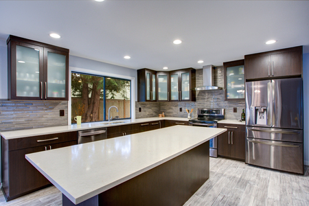
online poker

Dec-16-2019

What Is Art Deco?

Posted by Carpets N More under Design and Decorating

Interior design has many great styles to choose from when designing your home. From Rustic to Modern and everything in between, there is a style for everyone. Another great style option is Art Deco. This style first came to fruition during the roaring 1920s and was used in many attributes of design, including fashion and marketing. Art Deco merges geometrical patterns, metallic finishes, and bold colors to make something truly glamorous. If you love Art Deco and want to master it in your own home, here are some great tips and tricks:

Geometrical Patterns

A key factor in any great Art Deco design is geometrical patterns. Art Deco will incorporate repetitive patterns in many places. Consider some geometrical-patterned art for your walls or a patterned rug to spruce up the ground. Incorporating geometrical patterns is a must for your Art Deco design.

Adventurous

Be bold and adventurous when designing with Art Deco. While black and white are used a lot in Art Deco, this is used to create contrast. Art Deco does not neglect the power of colors. Art Deco uses bold colors and unique furniture to make a statement. Feel free to be adventurous and daring when designing your home.

Metallic Finishes

This Hollywood design is known for its glamorous, sheen look. To help obtain this look, make sure to include a lot of metallic finishes. Golds, silvers, even reflective chromes are all powerful elements in this retro-looking design theme. Make sure to add these fun, metallic finishes throughout your design.

Art Deco was a futuristic look of the past. It is flexible, allowing many colors and textures to be added to it. If you love this Retro look, make sure to use some of these key elements to help design your space. Art Deco is still used in many works of art and marketing today. Its unique and powerful style can quickly demand attention.

What do you think of Art Deco? Is this design still worthy of being in homes today, or does it belong in the past?

Dec-12-2019

Guest Rooms

Posted by Carpets N More under Design and Decorating
Dec-9-2019

Everything You Need to Know About Curtains

Posted by Carpets N More under Window Coverings

Curtains bring a sense of privacy and security to a room. They allow you to block out the sun and allow you that coveted, extra hour of sleep on the weekends. Curtains keep your television free of glare so that you can have everyone over to watch the early game despite it being a sunny afternoon. They provide you with a bit of privacy, even if you live so close to your neighbor that you could practically borrow sugar without leaving the house. Plus, curtains can also be that pop of color or touch of refinement that a room needs to feel complete. With the right knowledge, you want to choose curtains that are both purposeful and aesthetically-pleasing to your home. To help, we have four things you will want to consider.

What Type of Fabric?

Fabric choice is an excellent place to start when choosing your curtains. It is crucial to consider the purpose that your curtains will serve in any given room. Do you want privacy from the neighbors? Do you work the night shift and need to keep your room dark enough during the day to sleep? Blackout curtains may be the way to go. Possibly, you want to still let some natural light into the room, or you may just want to add dimension and another texture to the room. Velvet curtains are a great choice if you want a blackout curtain. Cotton and linen curtains range quite a bit in opacity, making them a great option if you still wish to add natural light. If you love the look of cotton or linen but need them to block out the light completely, you can always double them with a blackout lining.

Length and Width

Choosing the aesthetically-correct curtain for your windows can be difficult. For this project, let us move from the ground up to the ceiling. A good rule of thumb is to allow your curtains just to touch the ground – they should never hang higher than the floor. If you are trying for a more intimate look, you can let the curtains pool on the ground; this is only suggested for lighter cotton or linen curtains.

Once you have determined where you want the curtains to land, you must decide how high you would like them to hang. Typically, curtains are hung directly above the window frame, but you can create the illusion of taller windows by hanging the curtains just below the ceiling. In a similar fashion, you can create the illusion of wider windows by hanging the curtains outside of the window frame.

Color and Pattern Choice

Here is your chance to set the tone for your room with your curtains. Neutral and solid color curtains are timeless and can add elegance and refinement to a space. If your walls are a neutral color, you can add bold colored and dynamically-patterned curtains to change the look and feel of a room dramatically.

Hardware

The choice of hardware is another opportunity to either help your curtains blend in or stand out against the rest of the room. Curtain rods come in a variety of styles, so you can use them to add an extra touch of victorian refinement, rustic charm, industrial flair, or whatever style you may wish to accentuate in your home. Tiebacks and hooks are great opportunities to add flair or elegance to your curtains’ look.

The right type of curtains can bring something new and exciting to a room. They keep the light out when needed and can help solidify the style and feeling you wish to create in your home. Take these simple tips into account when shopping for your next set of curtains at Carpets N More.

Dec-5-2019

Choosing Flooring for Your Mud Room

Posted by Carpets N More under Flooring

Since mudrooms have the potential to get very dirty, it is essential to choose the most appropriate flooring. After all, the purpose of the mudroom is to put on and remove all of your outside gear, which includes your soiled coats and muddy shoes. Therefore, you will want to install flooring in your entryway or mudroom that is durable, able to withstand moisture and dirt, as well as harmonize with the rest of your home’s interior.

Floor Mats in the Entry Way

If you are indecisive, you can consider placing floor mats in your mudroom. Mats offer a soft transition between the mudroom and the rest of your home while protecting the floors. They trap pollen, dirt, and other pollutants that can easily come into the house. Opt for a floor mat or rug that is made from a wool material. Wool is the best choice because it is naturally resistant to moisture, mold, and bacteria.

Easy to Clean

Flooring for your mudroom should be easy to clean. Select tiles that have a nonporous surface. Some easy-to-clean flooring types include ceramic tile or natural stone. Such flooring materials will last longer and are easy to maintain as well as environmental-friendly. Slate and porcelain tiles are also suitable for the mudroom since this area of the home will get a lot of traffic.

Luxury Vinyl

LVP is another ideal flooring option for your home’s mudroom. It is budget-friendly as well as durable. It can also mimic the look of traditional flooring options like hardwood and tile with added durability and low-maintenance properties.

If you find it difficult to choose the right floors for your foyer or mudroom, one of our expert sales associates would love to assist you. Please do not hesitate to call or visit us with any questions.

Dec-3-2019

Four Seasonal Color Palettes

Posted by Carpets N More under Holiday

The holiday season is amongst us and full of cheer! It is always fun to decorate for the holidays and create a festive atmosphere in our homes. There are many ways to spruce up your space for the season. For example, adding a Christmas tree with a variation of lights, ornaments, and tinsel, as well as garland on the fireplace mantle, are all great ways to help make your home feel festive.

Décor can be placed throughout your whole house to help encapsulate the holiday spirit. While traditional Christmas décor can feel uniform and balanced throughout your home, you can always take your décor to the next level. For instance, if you have a neutral color palette home, Christmas décor will really pop. That being said, making your Christmas décor color palette match is essential to help the flow of the atmosphere. To help readers better understand, here are four great seasonal color palettes to consider in your home:

Red, Green, & Gold

This traditional color palette looks great in any setting since red and green are most commonly affiliated with Christmas décor. To spice it up, you can add some gold into the mix to help create a more luxurious feel. You will find that this color palette can be used in a variety of ways. For instance, a green pine tree with all red bulbs will look great with gold lights and tinsel. You can even carry this theme throughout the whole home, making green your primary color, red your secondary, and gold as your accent.

Silver, White, & Blue

Are you looking for an elegant and winter-inspired wonderland? Try using a silver, white, and blue color palette. This light and airy Christmas color palette can make your home feel elegant and beautiful. You can get a white Christmas tree and decorate it with silver and blue. Plus, this dazzling look can be added throughout the whole home. You can add white stockings and snow-inspired décor to create your winter oasis.

Warm, Earthy Tones

Are you not feeling the cold this winter? If so, make your home feel a little bit warmer with this rustic Christmas palette. You can add earthy, warm tones throughout your space while still being festive. The forest green from a real pine tree and garland in your home can be a great start. You can add pine cones and some candles to take a warmer approach on decorating your home.

Eclectic Style

Since Christmas is fun, you can be as creative as you desire! Perhaps you are into all the colors this season has to offer. From the diverse wrapping papers to rainbow-colored lights on the tree, this eclectic styling can be a fun way to decorate as well.

Let your holiday décor feel more uniform by adding a color theme to your space. What colors do you use during the holiday season? Have you tried any of these color themes? Let us know below in the comment section.

Nov-29-2019

How to Choose Dark Kitchen Cabinets

Posted by Carpets N More under Cabinets, Design and Decorating

Whether you are renovating or building a new home, one of the most essential decor choices that you will be choosing is the color of your kitchen cabinets. In fact, your kitchen cabinets will cover a large area and add to the overall look and feel of the kitchen. The color of your cabinets is the first thing someone notices when entering the room; therefore, the most crucial part of choosing dark kitchen cabinets is knowing how to mix and match them with other colors and textures. It is what will determine how good the kitchen looks at the end. To help everything flow properly, here are a few mixing and matching tips as you consider installing dark kitchen cabinets:

Balancing Act

Balance the dark shades with lighter colors, unless you want a depressing dark kitchen. One common combination, especially for luxury-themed kitchens, is black and white. Most dark shades also go well with white. You can also include aspects of other lighter colors such as a beige backsplash, light/medium brown flooring, or a soft white accent wall.

Let There Be Light

Make sure there is plenty of natural light coming into the space. If you are not careful, dark shades can create the perception of a much smaller room and can be depressing. To counter this, make sure that you have a lot of natural light coming into your kitchen. In the evening, make sure you have enough lighting to keep the space looking bright and airy.

The Dark Side

Match dark cabinets with other dark elements. While dark cabinets will pop out beautifully against a light-colored wall, they also look great when matched with dark flooring or other dark-colored elements in the kitchen. Plus, this will prevent the cabinets from looking like the only dark feature in the room. You can match the cabinets with dark flooring, a dark accent wall, or a dark countertop.

Dark cabinets will introduce a certain richness and depth that lighter colors just cannot achieve. While it may not have the same look as an all-white kitchen, it does bring a very calm and exciting twist to the space!

If you are in the market for new cabinets, Carpets N More has a wide range of high-quality cabinetry. Be sure to call or visit us for more information.

Nov-26-2019

Green Centerpieces

Posted by Carpets N More under Videos
Nov-21-2019

Tile Maintenance and Care

Posted by Carpets N More under Care and Maintenance, Tile

Tile is a beautiful addition to any home. Though tile is extremely durable and low maintenance, it should still be cared for overtime. If you have ceramic or porcelain tile, we put together some simple and easy maintenance to practice on your flooring. Remember, grout can be a little trickier and will take some more in-depth techniques to clean.

Ceramic vs. Porcelain

Ceramic and porcelain tiles are both made from clays. Porcelain clay is denser and less porous, so it typically more durable. Being less porous means it can be harder for water or soot to get deep into the tile as well. However, both tiles should be cleaned regularly to avoid build-up of unwanted grease and other residues.

Glazed Tiles

Glazed tiles can be easily cleaned by just using water without the need for soap. If liquids are spilled on the ceramic or porcelain tile, they should be cleaned quickly. Remember, ceramic is porous, which can allow liquids to penetrate through easily. If you spill a beverage on ceramic, it can quickly stain it if not removed promptly. Simply wipe away spills and add water to dilute. You can use a rag or paper towel to absorb all remaining liquid or residue.

Abrasive Tiles

For more abrasive tiles, consider using a mop or a bristled brush. Rinse your ground and mop with hot water. You can add a tile cleaning solution as well to help break down dirt and soot. You may want to go over your floor again with a clean water mop to ensure you eliminate all dirt in the area.

Polished Tiles

Polished tile can be very vulnerable to acidic products. Do not use acidic cleaner when cleaning polished ceramic or porcelain tiles. You will also want to immediately remove any spills or accidents with acidic liquids like citric fruits, wines, sodas, kinds of vinegar, and pet urine.

Glass Tiles

Never use an abrasive brush on glass tiles – this can scratch your tiles and be seen very easily. Remember this if you have glass as your backsplash as well. Many homes will use glass as a decorative accent in showers or in kitchen backsplashes. Simply, wipe clean with a damp sponge and pat dry.

Tiles are low maintenance and do not demand much work. However, it is essential to keep them clean to prevent the build-up of unwanted soot and grime. These simple tricks can be done whenever you feel like it is time to clean your floors.

Nov-18-2019

Decorating and Designing with the Color Grey

Posted by Carpets N More under Colors, Design and Decorating

Over the years, we have seen more and more shades of grey come into the marketplace. It has been a staple in home design and fashion for several years as a great neutral option while also feeling very sophisticated. Since some homeowners are hesitant that grey may be too dark, the design industry provides a broad spectrum of shades. With a spectrum ranging from black and white (literally), grey is an extremely versatile option to use in your own design. It will not clash with other colors but can feel elegant and timeless. Here are some great ideas to consider when decorating and designing your space with the color grey:

Grey Works Well with Cool Tones

Grey works great with complementing the cool tones throughout your home. It feels very grounded in nature and can help bring out the balance in rooms using cool tones. Use softer cool tones and the color grey to neutralize the space. You can even use black and white to accessorize your space without crossing out of your grey color palette.

Grey Works Well with Warm Tones

Grey can also work very well with warm tones. It can emphasize and balance your warm reds, oranges, and yellows while adding a darker neutral tone to the room. Where beige and tan can sometimes reflect too much into red tones and overwhelm the space, grey can help make the area grounded. It works great at complement to warm wood tones and other wood elements as well. When adding grey in spaces with warm tones, you will not get a dreary environment but a very well-grounded and established design.

Grey Is Sophisticated

Colors can influence moods. Grey is known to be a cool, neutral color that can create balance. It has a broad spectrum of moods, from dull and dingy to formal and sophisticated. It is incredibly diverse and can be used in any room. This is a quiet and reserved color, yet it can also be very influential. It is not very common to get a pure grey from just black and white mixed together. Most greys will have subtle hues of blues, greens, or yellows in them to help spruce up the space.

Empower your living space by incorporating grey. Using it throughout your design is never a bad decision. It works in almost all atmosphere and can be a great addition through flooring, cabinets, wall paint, décor, and more. Knowing when and where to use grey is vital.

What do you think of the grey color craze lately? Is it just a fad, or is grey really the perfect color for design? Let us know your thoughts below in the comment section!

Nov-15-2019

Three Styles Used for Backsplash Patterns

Posted by Carpets N More under Backsplash

When updating or installing a new kitchen backsplash, exploring the patterns and designs available on the market is imperative. Whether your goal is to “wow” guests with an elaborate design or to add a simplistic style to your kitchen, picking the appropriate backsplash pattern is essential so that it can serve as a complement to your kitchen’s decor. To help, you can gain some inspiration from these main types of backsplash patterns:

Focal Point Pattern

The traditional focal point backsplash pattern consists of backsplashes that are at least 18-inches in height. This offers you the option of framing the interior portion with a row of 4-inch tiles at the top and bottom. The interior can be filled in diagonally with the 4-inch pieces to create a traditional look. In essence, you are framing the center backsplash which creates a focal point.

Transition Border Pattern

The transition border pattern is a modern spin on the traditional tile installation. Consider installing a row of tiles at the bottom of the backsplash and using a glass mosaic pattern to border the top portion row. You can set the remaining field tiles above it into the cabinetry area.

The Contemporary Stacked Pattern

You can use the traditional tileset to make a bold statement. Start off by selecting a rectangular shape tile as opposed to the 3×6 subway style tiles and opt for something more modern such as a 2×8. Stack them horizontally on top of one another to form rows. This is a great way to bring a modern and sleek look to your kitchen. Remember, the type of backsplash material used can further enhance the look.

Which type of pattern was your favorite? Let us know below in the comment section.