online poker

Archive for the ‘Design and Decorating’ Category

Feb-17-2018

Easy Ways to Add Interest to the Kitchen

Posted by Carpets N More under Design and Decorating

The kitchen is so much more than just an area where you cook and eat. All too often, the kitchen becomes a small forgotten and isolated space, especially in older homes. In fact, many design experts describe the kitchen as the soul of a home. Yes, it’s the space where you’ll congregate with your family and in modern households it’s also a hub for activity. The kitchen can serve many different functions. Sometimes it’s a late-night workspace while other times it’s a casual hangout space.

It’s time to give this area of the home some attention. If you’re interested in making a statement with your kitchen’s design, then it’s time that you add some emphasis by creating a focal point.

When designing your kitchen, you may be tempted to purchase all the eye-catching fixtures, furniture and materials that you see in the store. Not only is the quickest way to max out your allotted budget, but you’ll also be committing a big design mistake. Using too many glitzy items will result in a busy design. It’s best to select a couple of noteworthy pieces and use other elements to support the piece.

Here are some easy ways you can create a focal point in your kitchen without breaking the bank.

Bold Backsplash Tiles
While the backsplash protects your walls from stains it can also be a big decorative element in the kitchen area. You can select backsplash tiles made from glass, wood, stone and a variety of other materials. Select tiles that feature a bold color or a striking design.

Countertops
Who said that you had to stick to traditional countertop materials? To create a focal point, opt for a nontraditional kitchen island. Such as one that is made from reclaimed wood. Accent countertops and islands are super trendy.

Accent Fixtures and Appliances
If you’re on a tight budget you can simply add in accent fixtures to make your kitchen pop. Try switching out your boring cabinet knobs for rose gold or chrome ones. Stainless steel appliances were fun years ago. Instead you can opt for colorful appliances. You’ll be surprised at how such a simple change can make your kitchen pop.

Artwork
Artwork isn’t just reserved for the living room and bedroom areas. Find an eclectic piece of art that you can hang up in your kitchen.

Tags:

When you are ready to start choosing colors for your home’s decor, it may seem overwhelming.  There are so many to pick from but you don’t want to make your space look too busy or cluttered by choosing incorrectly.  Making sure you strike the right balance is a must, but many people don’t know where to start or what guidelines to use to ensure success in their endeavor.  To keep things simple, we suggest using a popular rule well known in interior design: The 60-30-10 rule.


What is the 60-30-10 rule? Using these numbers as basic percentages, you can break down how to properly distribute color throughout any room you want to decorate.  Three colors is a good number for a start.  No need to overwhelm the space with too many things going on.  The basic idea of the rule is to use 60% of the space for a dominant color, 30% on a secondary color and 10% on an accent color.


The dominant color, or 60% of your space, is usually reserved for wall color as this is the largest surface area in the room.  Using a neutral color is best since it will be more versatile if you want to change up the look of the room every now and then. Updating the accessories in the room is definitely easier than having to repaint all the walls.


The secondary color, or 30% of your space, refers mostly to any upholstered furniture in the room or even a large area rug.  It is also recommended to also choose a color that is more on the neutral side as well so that your large pieces complement the wall color as well as keep the focus on your accessories.  You can even play around with lighter or darker shades of the color you are currently using on the walls. 


The accent color, the final 10% of the space, is where you will be able to inject some fun into the room.  With the neutral foundation, you will have created in the space, choosing a color that pops will definitely draw the eye upon entering.  Using accessories in the same color family will keep you from having to use the same exact shade for everything.  For example, multiple shades of reds or blues will really shine when showcased properly.  Try to hang a picture or piece of art on the wall that ties in with your accent color to bring it all together.


Embrace the 60-30-10 rule today and see how easy it is to decorate any room in your home.

Tags:
Jun-20-2016

Stylish Décor Trends

Posted by Carpets N More under Design and Decorating

Do you love to be on the cutting edge of home décor trends? Find out what these new trends are and how to best apply them to your home!

Two toned cabinets are becoming quite popular. This idea works great because by selecting two different cabinet finishes the space instantly looks custom! The variety of combinations are endless. Decorate with different dishes on upper and lower cabinets, or you can select two different finishes for one entire aspect of a room than the adjacent side. However, make sure to keep the cabinet styles and hardware the same.

Stainless steel appliances move over! Black stainless steel is here! That’s right you heard us correctly! This finish for appliances is becoming more readily available. Use this finish for a sophisticated or modern space. Enhance your kitchen by adding some futuristic sleekness!

Traditional living rooms without TVs or gadgets are coming back full circle. More and more families are choosing to have living rooms devoid of screen time, in order to really interact with one another. These living rooms are the places where beautiful family memories will be made and cherished. Families are living their lives together and being present to really enjoy with family and loved ones. These living rooms also make an excellent place to read an actual book or take a quick cat nap.

Formal dining rooms are also making a comeback. Creating a space where beautiful home cooked meals can be enjoyed without distraction is something that is becoming more important in today’s society. Slow down, have more dinner parties and live your life interacting with family and friends. Like the living room, having a formal dining room free of distractions, keeps us present to make memories with everyone we eat with!

Mirrors are also a hot trend in glamorous kitchens. You can check your hair and makeup while cooking and admire your kitchen while at the stove. The mirrors add sparkle and glitz to this previously utilitarian space we call the kitchen. More people are enjoying preparing home cooked meals, especially since it’s so easy to have the ingredients shipped to your door. People are enjoying their time using their kitchens and loving the space they created!

Tags:
Jan-26-2015

Glam DIY Accessories For Your Vanity or Desktop

Posted by Carpets N More under Design and Decorating

If you’re a glamour girl and you like the style of your home to reflect it, don’t leave out the small details. Any glamour girl knows that a look is never complete without accessories and this includes the home. Here are some simple but effective ideas for giving your desk or vanity the finishing touch! 

Crystal vases: No DIY work required. Crystal exudes glitz and sophistication on its own. But skip the flowers because that’s too obvious. Instead, use them to store small items. Such as cotton balls, hair ties, paper clips, etc. This looks best when filled to the top so don’t use a vase that’s too large.

Glass, cylindrical vases: These are neat because you can see the items inside. So use them for things are aesthetically pleasing when grouped together. Nail polishes, lipsticks, colored pencils, etc. Again, the contents should fill the vase all the way to the top for it to look finished and decorative.

Glitter candles: No glam room is complete without glitter. Purchase plain white candles. Use Mod Podge and apply it in small dots or other designs around the candle. Rotate the candle while sprinkling it with fine grain glitter. It will be concentrated where the glue is and more spread out on the rest of the candle. Let dry and set in a crystal candle holder.

Small scale coffee table books with subjects that are glamorous: Use these to create tiers on your desk or vanity. Set vases, candle holders and other pretty items on them for display. This looks more interesting and polished than everything sitting at the same level. 

Nov-13-2014

Urban Chic Design Style

Posted by Carpets N More under Design and Decorating

If you like Urban Chic – then clutter, conformity and the complicated have no place in your home. Low tech, high maintenance and the middle ground aren’t for you. Knickknacks are a no-no, less is more, and form faithfully follows function.

If this sounds like you, then your lifestyle is Urban Chic. It originated in the Bauhaus art movement of the 1920’s and has also been called Contemporary. Its heritage can also be traced to the 1930’s German and Scandinavian design schools.

Urban Chic :

Treats spaces almost as pieces of three-dimensional art, balancing form, shape, color and texture – texture from rough and smooth to glossy and matte.

The spaces are highly functional and well organized with lots of storage to eliminate clutter, celebrate order and meet the demands of your modern life.

Surfaces are simple, colors are clean and pure, shapes are geometric with immaculate detail. The look is linear, pared down and polished.

Your Urban Chic furnishings are sleek and strong but uncomplicated in shape, allowing them to mix effortlessly with other styles of furniture.

It all has the effect of creating a home that is cool and contemporary, urban and fresh, sophisticated and streamlined.

A recent interpretation of this style is a movement called Loft Living.

These are homes of modern architectural shape featuring vaulting ceilings, open, spacious floor plans and a multitude of high, wide windows.

The look is a unique combination of industrial masculinity and refined elegance.

Art Deco, the marriage of art and industry, is another variation of Urban Chic.

Introduced in 1925, this style created geometric and asymmetric furnishings of beautiful, organic simplicity.

A dining table with chrome base and glass top was a classic example.

Variations aside, the classic products for your Urban Chic home include stunning glass mosaic tiles, the widespread application of stainless steel and natural complements like honed limestone.

Your colors are serene and seductive; creative combinations of black and white, mahogany browns and stainless steel.

In your kitchen, slab door style cabinetry in dark walnut with euro rail hardware is the perfect answer. And granite countertops — in black of course — are the ideal complement.

This is the Urban Chic lifestyle.  Is this your way of living? See more design styles here!

15285255_SWhat is the first thing you notice about this room scene? Red, right! Red is a bold color that tends to stand out whether in interior design, an accessory to an outfit, or as a car color driving by on the street.  It reminds us of the power of red as a color in decorating.  Red is a great color for the home and can be used as a wall or accent color.

A few years ago red dining rooms were all the rage. This could have stemmed from the study that showed red increases our appetite. Today we are seeing fewer red dining rooms but not less red in interiors.

Red is a powerful color when used in its pure form. Power suits and ties are often red because of the strength of this color.  Having a red wall or red carpet makes a very strong design statement in a room.  For this reason many people prefer to use red as an accent color. Red today is often used as an accent color on area rugs and pillows.

The variation of red hues can run from plums to tomato reds, which allow red to be used in a wide variety of color palette. Terracotta red tile floors are great in the kitchen while deep plum is a cozy color for the walls in a master bedroom.  Red and grey is also a great color combination for the living room.

Reds work with neutrals like grey, other warm colors like orange, or contrast with cool colors like aqua.  Adding a pop of red to your counter top or sofa will bring energy to your room.

Jan-28-2014

The Power of Green

Posted by Carpets N More under Design and Decorating, Hints and Tips

19246412_SGreen as a color or green as an environmental movement can be a powerful addition to a space. Green color can be introduced through paint and fabrics, rugs and accessories in both color and environmental friendliness.  A simple way to be green in both senses is to have house plants in your home.

Not only do houseplants add a pop of green color to a room, they can also clean the air.  Great for a room like a nursery or home office where you spend a lot of time. Variations of house plants do a better job than others cleaning the air, so do your research or ask at your local garden center.

A hot trend in decorating right now is terrariums. If you hear the word terrarium and think of a school project, think again. Today’s terrariums are stylish and chic. What they do have in common with the old school terrariums of your childhood is that they are a great DIY project. Almost any glass vessel, from a mason jar to a fishbowl, can be turned into a terrarium. This is a great project to do with your kids.  It is a nice way to introduce them to growing plants, which could lead to an interest in a kitchen garden.

Terrariums are great decoration for a shelf, table or even the kitchen window sill. Check online for tips and tricks to designing and maintaining a chic and stylish terrarium. House plants and terrariums are a great way to go green in your home.

Feb-17-2013

Spicing Up the Bedroom

Posted by Carpets N More under Design and Decorating, Hardwood / Laminate

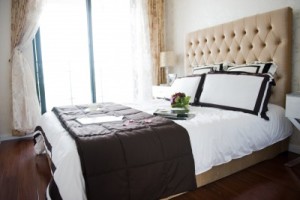
13536537_SIf your bedroom is feeling a little bland, you can easily spice things up if you have a good foundation.  A suite of bedroom furniture that provides a bed, nightstands and a dresser makes for good design bones for a bedroom. However, all the matching furniture and finishes need to be livened up with accessories and additional furnishings to create a lively and interesting bedroom.

This bedroom is a great example of having good bones.  The cream colored bedroom suite is a nice way to begin to decorate the bedroom.  The neutral cream color allows you to go in any direction with wall, floor and accent colors.  You could stick with the neutrals and layer in deeper neutrals like grey on the walls, pillows or duvet. An area rug could be used to add color, texture and pattern, and still show off the beautiful wood floors.

Color can be applied on the walls and windows as well.  Paint is a quick and inexpensive way to bring color into a room. Curtains can also be used to add color and pattern to the space.  Smaller pops of color could be done in accent pillows, a colorful lampshade, or a lampshade trimmed with bright ribbon. Swapping out the lamp for a colorful one is another idea.

If you prefer neutral walls, add color to the walls with artwork or a hanging.  You could frame a collection of family photos—great for a bedroom. Paintings and prints are other ways to bring color onto the walls without painting the wall.

Jan-19-2013

Fit for a Princess

Posted by Carpets N More under Design and Decorating

Screen Shot 2013-02-07 at 1.52.01 PMThe popular fairy tale The Princess and The Pea tells the story of a very particular princess. Any parent of a little girl knows that their own little princess can be just as particular when it comes to her clothes, toys and room.

Designing a bedroom fit for a particular princess can be a challenge. It is important that your girl knows her opinions are being heard and considered while you the parents get the final say in the design of the room. Working together is the best way to achieve a design you are both pleased with in the end.

Choosing classic designs and materials will mean your room will endure the changing tastes and styles as your princess grows up. While your teenager may not like the same designs and colors as your toddler, there are some design elements that can please both. Good quality flooring is one of them.

Selecting a neutral floor for your girl’s room means finding something durable as well as classic to suit changing tastes. Neutral carpet that can go with various wall and linen colors is a good choice. Hardwood floors and soft area rugs are another. The hardwood will last over the years while the area rugs can be changed with changing tastes.

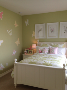
Classic floral wallpaper that isn’t too trendy or thematic is another design element that can outlast the latest fad. Select a wallpaper that works with your flooring for a polished design perfect for a little or big princess. A great solution is painting the walls a color she picks out and then adding wall decals that are easy to put up and take down if she decides to change her mind.

Oct-17-2012

Home Office Must Haves

Posted by Carpets N More under Design and Decorating

If you are lucky to have a designated room as your home office, there are some key design elements you’ll want to include in the room: a work surface; comfortable chair; task lighting; and storage. These four elements form the very basic elements of a home office. Once you have these in place you can begin to personalize the space with color, pattern and decorative accessories like art.

A home office work surface can be a classic desk with fire drawers in the base. Or it can be a vintage table that you’ve refinished. Determine what kind of work you’ll be doing and how much desk space you’ll need.

The desk chair you choose doesn’t have to be a standard office style chair but it should offer good support for your back.  Test out several styles of chairs to see what will work for your back and your design style. Take into consideration what type of flooring you have in the home office. If you want a chair that rolls you may need a hard mat to protect carpeting and rugs.

Task lighting is important for a workspace. Beyond the overhead lighting in the room, you’ll want something to illuminate the work surface. Table lamps and adjustable desk lamps are good choices.

Finally storage is key for an organized home office. You don’t need to buy standard filing cabinets but you will want a place for files. Look for filing cabinets that look more like furniture. Baskets and decorative boxes on shelves can store important files.