online poker

Apr-16-2019

Why Luxury Vinyl Tile?

Posted by Carpets N More under Flooring, Luxury vinyl tile

Luxury Vinyl Tile has become an extremely popular flooring choice amongst homeowners. Loved for its style choices and durability, Luxury Vinyl Tile can provide everything you want in one flooring option. If you are interested in learning more about Luxury Vinyl Tile, we created this simple guide to help you. Enjoy!

Why Luxury Vinyl Tile?

Also known as LVT, Luxury Vinyl Tile is the solution for active homes wanting a stylish, affordable flooring option. LVT is constructed with several layers: a wear layer, image layer, and a core and backing. Luxury Vinyl Tile is 100% waterproof, making sure that it will not swell or buckle. Lastly, LVT is exceptionally durable, making it the perfect choice for active, busy households. Its scratch, stain, and wear resistant allows it to thrive in the busiest of homes.

Easy Installation

Luxury Vinyl Tile is easy to install and can be used in rooms that you never imagined possible. This unique flooring can work in basements, kitchens, and bathrooms to create a trendy and stylish look. Plus, with an array of different sizes, colors, textures, and styles, you are sure to find one that you will love.

The Perfect Alternative

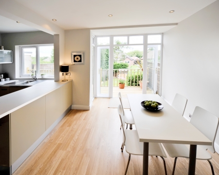
Luxury Vinyl Tile (LVT) is the perfect alternative solution to hardwood and ceramic tile. With LVT, you can get the look of hardwood without sacrificing durability. Plus, LVT works perfectly in moisture-attracting rooms—giving homeowners the opportunity to put in places that they never imagined possible! LVT is also an excellent alternative for ceramic tile because it is softer and warmer than tile’s hard-surface.

Plenty of Styles

Luxury Vinyl Tile’s versatility makes it a popular choice amongst homeowners. Whether you are looking for something close to hardwood or natural stone, LVT can give you the look and performance that you are seeking. Some of the stylish options for homeowners to choose from are Authentic-Looking Wood, Natural Stone, and Textured/Finished Effects.

We have a wide selection of different Luxury Vinyl Tile options for homeowners. To browse our vast selection of LVT, take a look at our online showroom here.
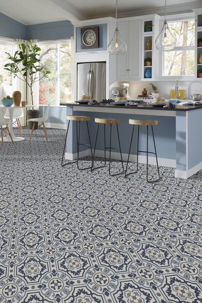
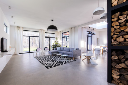
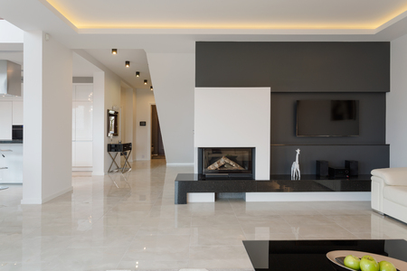
While both are commonly used as interchangeable words, Modern and Contemporary Design both have distinct differences. Knowing their differences can help you better generate a style for your own home or business. As we explored in Part One, Modern Design is a style with unambiguous guidelines and rules which created it; however, Contemporary is a little more open-ended. Let us take a more in-depth look into what makes Contemporary Design.

Contemporary Design

While Contemporary Design gives some homage to Modern Design in its open layout, it is its own exclusive entity. Contemporary Design can seem a bit eclectic and like a mix of several designs such as Art Deco, Mid-Century Modern, even Hollywood Glam. Yet, what makes this style so unique, is that it is always evolving. This style is always about today’s current fads and trends. Contemporary Design will usually involve some more unique design furniture and lighting. It will pull from many fashions or genres that seem to be the most influential in the industry currently. Geometric patterns have seemed to make a strong influence in recent styling and are currently trending in this style. Likewise, applying trending colors and patterns is a standard move with this design. While this design may feel eclectic, it still uses a minimalistic approach. Do not overcrowd your space and make it feel cluttered. This also will have you stray from ornate and overly lavished décor. Clean and crisp are still very important to encapsulating this style. Your atmosphere is sure to be very unique and eye-catching yet does not lose focus. Neutral color palettes are still welcomed yet popping colors and hard contrasts can set this design apart.

Contemporary Design is great for people willing to adapt. Never get too satisfied with a space and be ready to change. Staying up with today’s latest trends will help you keep your space fresh and trendy. So, next time you see a Modern or Contemporary space, you will be able to identify the differences and better understand each design.

Interior design has many different types of styles. From Hollywood Glam to Rustic, there are many designs in which we can pull inspiration. Many styles have evolved over the years and became trademarks to the stylings that we incorporate in our homes and businesses today. Some designs have come and passed, and others are still being created. Some designs have even meshed together to create something new and unique. For example, Traditional Design is a very classical look yet when mixed with modern; it finds a balance in the transition of eras. We refer to this design style as Traditional. Yet what is Modern Design? Many people use the term Modern and Contemporary Design interchangeably; however, they are two very distinct, different styles. We will explore both designs so you can decide which one may be best for you. Both have advantages, disadvantages, and personal preferences which allows them to be unique to you. Join us as we explore what makes a mid-century modern home and check out what creates a contemporary home for more details.

Mid-Century Modern

So, first, we need to understand that “Modern” does not mean “as of today.” Modern design refers to a time era in design that has come and passed. Because of this, it cannot continue to change. The rules and guidelines to this style are pretty set in stone. Mid-Century modern was established in the 1930s-1960s, and it was used in architecture, industrial, interior, and even marketing. This design happened right after World War II when families began to move from the more rural area to live in more urban neighborhoods. This change correlated with smaller homes and with it came an adaptation to make a style that worked. With smaller spaces, people still wanted to have their home’s feel big, which meant minimalism, simplicity, functionality, and an open layout were a must. Modern homes would typically have a neutral color palette yet could add color through muted tones. Most of the lines in the architecture would be sleek and clean cut. To make the homes feel more open, geometrical, crisp furniture was introduced. Materials were entering the market during this time which made plastics, glasses, metals, and woods all valid options to use in this design.

Now that you can identify Modern design, it is essential to see what makes Contemporary design different. Check out Part Two for a greater understanding. For more insight on design themes and differences, make sure to subscribe to our content!

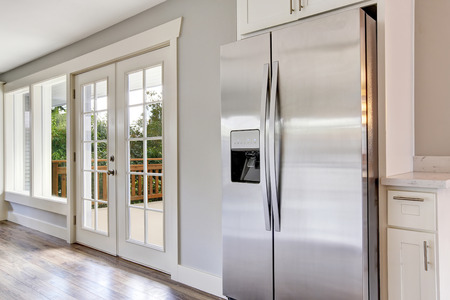
Stainless steel is a beautiful finish that looks even better when it is gleaming and shining. In fact, many homeowners feel that stainless steel can make any space feel modern and sleek. That being said, anyone with stainless steel appliances and surfaces in their kitchen will tell you that keeping this finish spotless can be a challenge, especially if you have little ones or a big family. How can you keep your stainless steel surfaces free from watermarks and fingerprints? Check out our tips and tricks:

Cleaning a Steel Range

When cleaning a stainless steel stove or range, you will really have to “dig in deep.” It is not enough to simply clean the top surface. You will need to remove the control knobs because dirt and grime often get stuck under them. When you do not remove the knobs to clean them, remnants of the food you have been cooking as well as other types of grime will build up in that area which is unsanitary and eventually become hard to remove. Also, make sure you clean the hood so that grease does not accumulate.

Stainless Steel Appliances Handles

The handles on your stainless steel appliances will require regular cleaning since we tend to touch these areas often. Use a damp microfiber cloth to wipe them down a couple of days out of the week. It is best to use fine-woven microfiber cloths that are used to clean eyeglasses. This material is great at effectively removing dust and dirt without leaving behind smears or streaks.

Prevent Oxidation

Have you ever noticed a white film developing over a stainless steel surface? This is called oxidation. When steel begins to oxidize, a white film starts to grow over the surface creating a cloudy effect. You can fight against oxidation by applying a pumice powder and water mixture on your appliances. Pumice powder can be purchased at a local hardware store.

Cleaning the Countertops

If you have stainless steel countertops, a weekly cleaning of your countertops will keep the kitchen looking fresh. Plus, you do not have to use expensive cleaners, and you should avoid abrasive cleaning agents. In fact, a simple dish detergent and water mixture can be effective. Use a light dish towel during the cleaning process so that you do not scratch the surface.

Do you have any tips or tricks of your own for cleaning stainless steel appliances? We would love to hear your recommendations below in the comment section. Thanks for reading!

Apr-2-2019

The LED Light Show

Posted by Carpets N More under Lighting

Lights amplify the energy in the room. LED strip lights are great to add to your space but should be used subtly and to highlight focal points, not to cover the room. They can be a great remedy to enhance a room with dark walls or be used to show the depth of wall art. LED light strips can be done very tastefully when applied correctly and should be reinitiated into your design theme if not there already. Here are five great ways to add LED lights strips to your home:

Under Cabinetry

If you need task lighting in your kitchen, consider installing LED light strips under your floating overhead cabinetry. It will allow light under your cabinets which can help keep your room from feeling overshaded while you work in the kitchen.

Behind Your Television

Another great place to put LED light stripping is behind your television. It will enhance your entertainment stand’s overall aesthetic look while also visually adding depth. The human eye is naturally attracted to the concept of depth which will make you entertainment stand look great all the time.

Behind Wall-Mounted Artwork

If you have artwork on a wall, consider install LED lights being them. It is a great way to make artwork pop and become a focal point of the room. Plus, it is also a great trick to use on dark walls to make the room still feel well-lit and energetic.

In Display Nooks

Display nooks and bookshelves naturally hinder the flow of light. If you notice that your display shelves are not getting adequate lighting, install LED lights strips subtly to shine down on each shelf. It will make your display items look more intriguing and help keep dark areas looking fresh and well-kept.

Outdoors

Have you considered embedding light strips into your outdoor planters? It can turn your boring outdoors into a luxurious, contemporary oasis. Doing this can not only keep the outdoors lit at night but can make your plants look mesmerizing throughout the evenings.

If you think LED strips are outdated or not for you, consider these stylish trends. LED lights are design tricks that can help revamp any room and make it feel livelier. For more great tips and tricks, visit us at Carpets N More.

Tags: ,

If your home has an open floor plan, it can easily began to feel like your decor is chaotic. With no walls to distinguish space and function, it might seem like everything is just roaming free. That is where area rugs come into play. The right area rugs can be a valuable asset to a open floor plan because they help give the illusion of order without the need for walls. However, if you plan on using several rugs together, it is important to give thought to how they will look together. While the easiest solution may be to use matching rugs, this can sometimes be aesthetically boring and may even ruin the look you wanted to capture. To help, check out these tips for using multiple area rugs in an open floor plan:

Using Matching Area Rugs

When using multiple area rugs in one space, you might be tempted to take the simplest approach which is opting for matching rugs. Using matching rugs will help keep the spaces separate while keeping things harmonious. While using matching area rugs is a bit unpredictable if you really want to take this approach, consider choosing a rug that features a bold graphic pattern. Using such a high contrast pattern rug keeps things interesting, and it does not overwhelm the space.

Using Different Area Rugs

You also have the option of using distinct floor coverings. Using different area rugs within the same space can seem a bit scary, but it can actually turn out great if it is pulled off right. You can use different floor coverings to distinguish the function of each space or section. The key to pulling this off is by choosing rugs that feature similar color palettes.

Believe it or not, you can have fun with pairing different types of rugs together. Of course, it is easier to pair solid colored rugs than ones featuring a pattern. When pairing solid rugs, just select two colored rugs that look great together. Neutral colored rugs will look great with just about any rug, but if you want to go the color route, try to find a color that is used in both area rugs to pull their designs together in the open space.

What are your thoughts on area rugs in open floor plans? Do you like using different rugs or similar ones? We would love to hear your thoughts below in the comment section.

Tags:
Mar-27-2019

How to Design an Accent Wall

Posted by Carpets N More under Design and Decorating

Every room can use a little something to help empower the theme. If you want to add more color to a space or simply make a bold statement, consider adding an accent wall. Accent walls perfect for creating depth to the room and making a focal point for the design theme to follow. There are several ways to approach this idea; here are our top picks:

Bold Color

Applying a bold color to a single wall can be a great way to make a strong statement. If you are looking to add color to a room, what better way than on an accent wall? Choose one wall that you want to establish as a focus point, and make this wall a different color than the surrounding walls in the room. An accent wall will draw attention, so keep in mind what wall this will be in your space. Typically, this becomes a focal point and is often near a fireplace or large window, but you can be creative as well. You can even add an accent wall to a smaller wall or a less noticeable wall to add character all around the area.

Balance

Incorporating an accent wall can create harmony in the room. If you have a color theme, have your accent wall correspond with it. If you want to attempt to have a color theme in your room, this is your opportunity. Your accent wall should complement the room accessories, and it is the perfect way to enhance the area without having to paint all the walls!

Other Options

You do not have to create your accent wall with just a different paint color. Tiled backsplashes, brick walls, and even wallpaper can all be used to create your accent wall. Think of painting stripes or a pattern to add character to the room. An accent wall can significantly improve a room’s overall aesthetics; all you need is a little imagination.

Have you created an accent wall in your home? What are your tips and tricks for nailing the design? We would love to hear your thoughts and advice below in the comment section.

Tags:
Mar-21-2019

Tips for Working with the Color Plum

Posted by Carpets N More under Colors, Design and Decorating

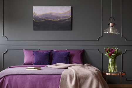
Plum is a vibrant hue that can add a luxurious feel to any space. However, if you enjoy a minimalist design, this color can also add some spice while providing those clean and neat lines that you love. In fact, plum looks great in both traditional and modern designs.

Plum vs. Purple

You may be wondering “how does plum different from purple?” For many, differentiating between the two can be challenging, especially when it is time to implement the color in a design scheme. Plum is a hue of purple that falls right between the magenta and purple spectrum. It is a deep and warm color that is considered classic and regal. On the other hand, depending on what colors you pair this hue with it can come off as super bright and earthy. Luckily, plum is a versatile color that offers homeowners with a little wiggle room during the design process.

Plum as a Wall Color

Since plum is a rich color, it can instantly add depth and weight to the walls. Added depth and weight will visually expand the room. Often, when painted on the walls, plum acts as an accent color. You can trim your neutral walls with plum, or if you are feeling especially bold, you can create an accent wall featuring this rich tone.

In a room with a lot of architectural details such as arches and beams, plum looks great when painted on all the walls and the trim is left white. In fact, white trim makes the plum color pop and prevents the room from looking too dark.

Plum and Bold Colors

When working with plum, you do not always have to pair it with more neutral shades. Plum looks great with other bright colors such as vibrant blues and purples. When you are using this color on your walls, you can opt for other bright colored accessories. Plum and pink is another beautiful combination, especially for a bedroom. It gives you a feminine flair without being too girly. Combining other colors like turquoise and chartreuse will definitely make a room pop. If you are planning on making plum a dominant hue in the room, make sure you use other colors to truly bring out the beauty of this shade of purple.

Tags:
Mar-20-2019

What is Maximalism Interior Design?

Posted by Carpets N More under Design and Decorating

You have probably heard of the term minimalism, or less is more. This has been a trending style over the last couple of years. While it will never fade because of its functionality and style, it created a new style along with it. With minimalism, the design of maximalism was born. This style took longer to develop correctly, but now is being used in homes and stores today. Maximalism utilizes every inch of square space to be expressive. It does not focus on “less is more” but allows everything to shine. This eclectic design still has strict guidelines to make sure it is executed correctly. Here is everything you need to know about incorporating maximalism into your home:

It Is Okay to Be Busy

Stop saying less is more. Designing a space is your chance to express yourself and make a statement. Be bold and put unexpected patterns and unique combinations together. From high-designed wallpaper to custom area rugs, this style feels busy, yet throughout all the elements, it still feels balanced. Most designs find a focal point to reflect or give homage. In this design style, however, every elegant pattern, unique throw pillow, colorful curtains, and extraordinary piece of wall art can stand alone. The focus of this design is every piece should be focused on individually. Do not match furniture but allow each piece to feel unique and special to the atmosphere. Remember, just because everything can stand alone, it still needs to feel cohesive to the environment.

High Level of Detail

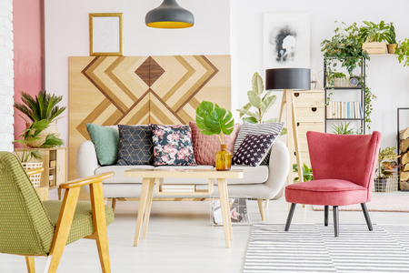
Maximalist Design does not mean a cluttered, eclectic mess. Instead of a single picture, incorporate a gallery wall. In its place of a monotoned carpet, invest in a highly charismatic rug with high, intricate levels of designs. Think abundance of textures in the atmosphere. You can have giant pillows, textured walls, throw blankets and pillows. Allow your décor the opportunity to enhance the space, not be shadowed by the theme.

Very Open Color Palette

Unlike minimalism, maximalism design has a very accepting color palette. You can use warm tones and cool tones. You can use neon or pastel hues. You can also have the occasional black and white in the room to create a hard contrast. Colors are highly influential in the environment. All your colors to create your space!

Maximalist is a highly trending design. It is incredibly expressive and can feel glamorous and classy while incorporating high levels of design. While this design can be challenging to perfect, it is beautiful when done correctly. Let your home be an expressive outlet of your personal styles and taste to best express yourself. For more insight on some of the most trending interior design styles, make sure to subscribe, and let us know below what your favorite interior design style is!

Tags:
Mar-14-2019

Reasons Why You May Want to Choose Laminate

Posted by Carpets N More under Flooring

Laminate has become an increasingly popular flooring choice for homeowners that are looking for beautiful floors without a “beautiful” price tag. If you have a budget in mind and do not want to sacrifice quality, we would love to share with you eight reasons why you should choose laminate. Let’s take a look at popular reasons homeowners have selected this flooring choice.

A Comfortable Touch

Other flooring options can feel harsh on your feet and even your back. Laminate flooring provides a softer and warmer underfoot for a more comfortable experience.

Easy Maintenance

Who does not want an easy-to-maintain flooring option? We sure do! With laminate, you are guaranteed easy care and maintenance.

Budget-Friendly Solution

Laminate is a budget-friendly solution for homeowners looking for beautiful floors without a hefty price tag.

Replicates The Look of High-End Flooring

When natural stone and traditional hardwood are out of the budget, you can rest assure that laminate will be there. With realistic wood and tile looks, you can design the home of your designs without breaking the bank.

Scratch Resistant

If durability is a must, laminate flooring is five times more resistant to scratches than traditional hardwood floors.

Improved Air Quality

With certified laminate options available from Mannington Flooring, you can help improve your home’s air quality with laminate flooring.

Eco-Friendly Options

Laminate can be an environmental-friendly solution to other flooring products. With options containing over 70% recycled materials and low-VOC, you can help contribute to environmental conservation with the right choice in flooring.

No Grout Lines

Some homeowners find grout to be a bit of an eyesore. With laminate, there is a grout-free installation; creating a seamless and beautiful flooring.

Are you interested in learning more about laminate or want to view our selection? We would love to assist you in your search and show you the great products we have to offer. Call us or visit one of our showrooms at for more information and pricing. We look forward to working with you!

Tags: